Corporate Planner
My Role : Lead UX Designer, Front-End Developer, Researcher
Problem Statement: Fidelity corporate communications struggled to organize internal and external outgoing communications. Many time communications overlapped with each other and spammed customers and other times the mail systems were overworked and the communications didnt go out on time due to demand on the servers.
Solution: I created a new communication calendar that allowed all business units to see each others communication and campaign schedules in a visual way so they could better organize their outbound items. This increased efficiency, decreased server load, and gave customers a logical communication chain that didn’t spam them.
The Solution
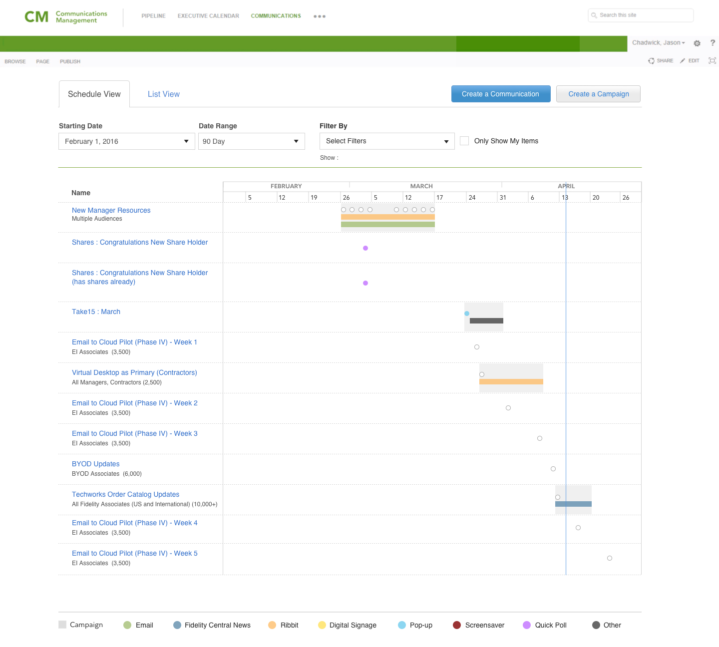
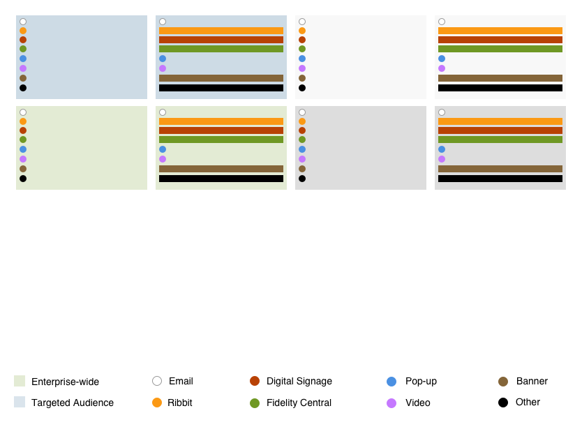
We created a product that matched the Fidelity corporate brand, yet worked across all business units. Each specific media channel was identified by color. The width span was the time of which it ran, and the gray background symbolized weather the elements were combined inside of a campaign or not. We decided to start customers with a 90 day window so they would be able to look an entire quarter ahead and give more incentive to get your communications in early so they would not be competing with other outgoing media.
Ideation/Research
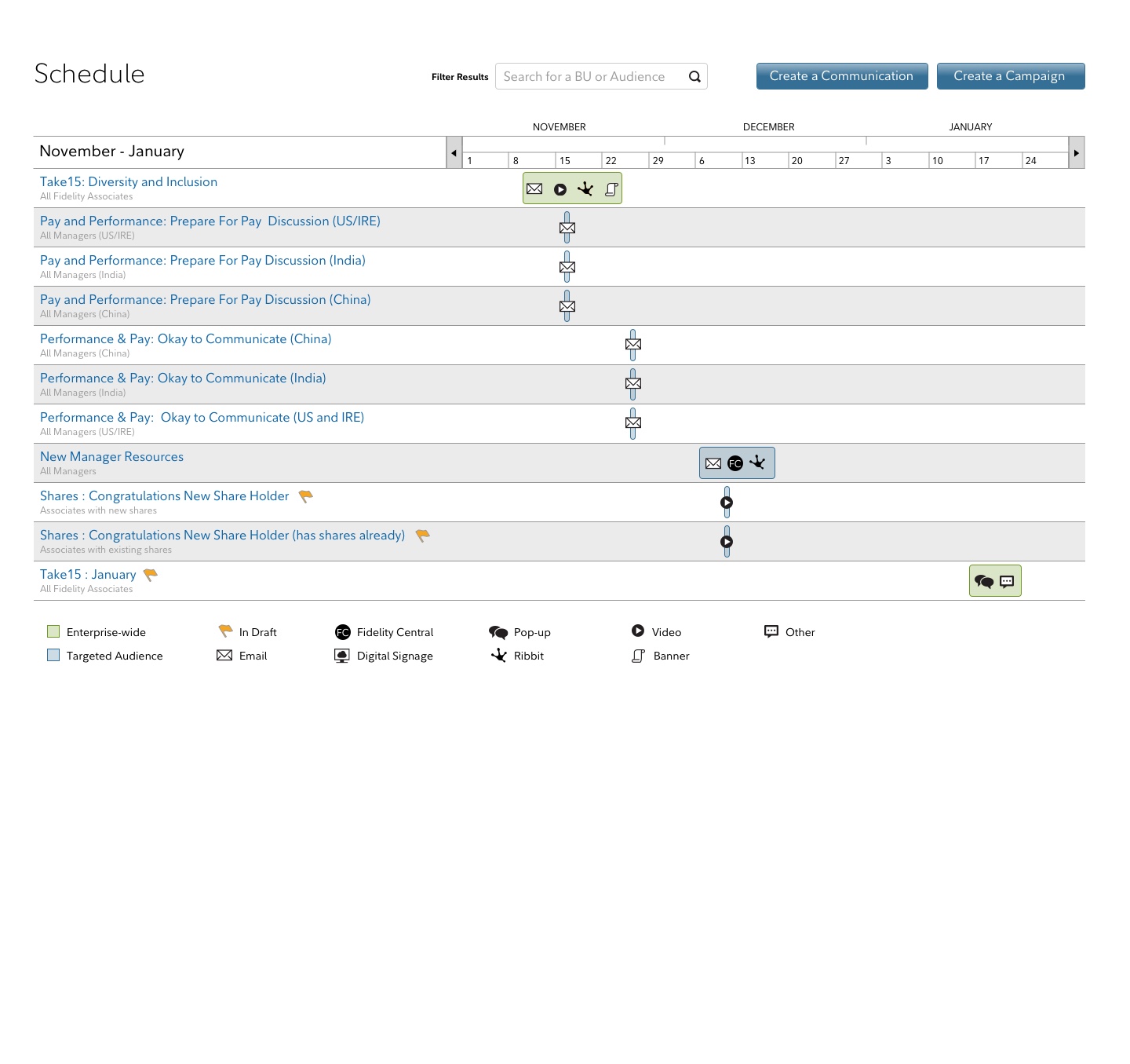
Initially a good deal of time was spent working on whether or not we use symbols or just color as our legend or choice. After significant thought, we decided that symbols were much the same and actually made it harder to delineate what each meant. For users that have color blindness, we created a features that let them touch, click or hover over the event and we would spell out what the communication channel was in full detail.
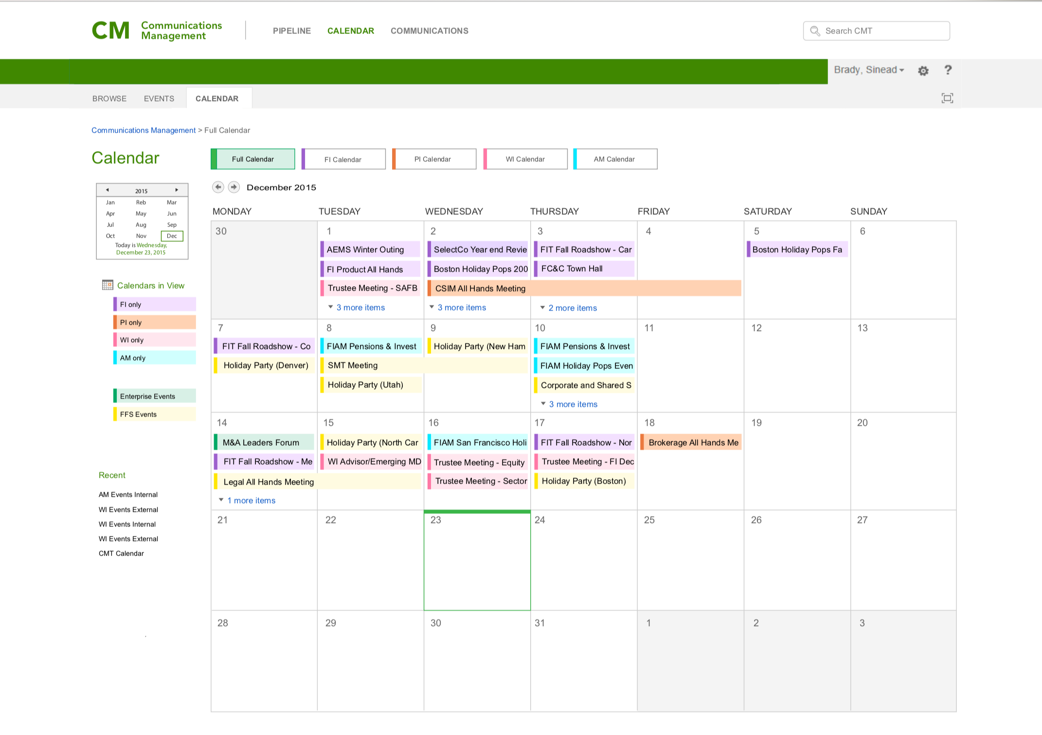
We initially dabbled with using a monthly calendar view, but we had problems getting all communications to list on a single day without having to create “more content” on many of the high usage days.
I met with multiple stakeholders and customers throughout the company to make sure our goals aligned with theirs. As we gathered information, we began to formulate a plan for a minimum viable product.
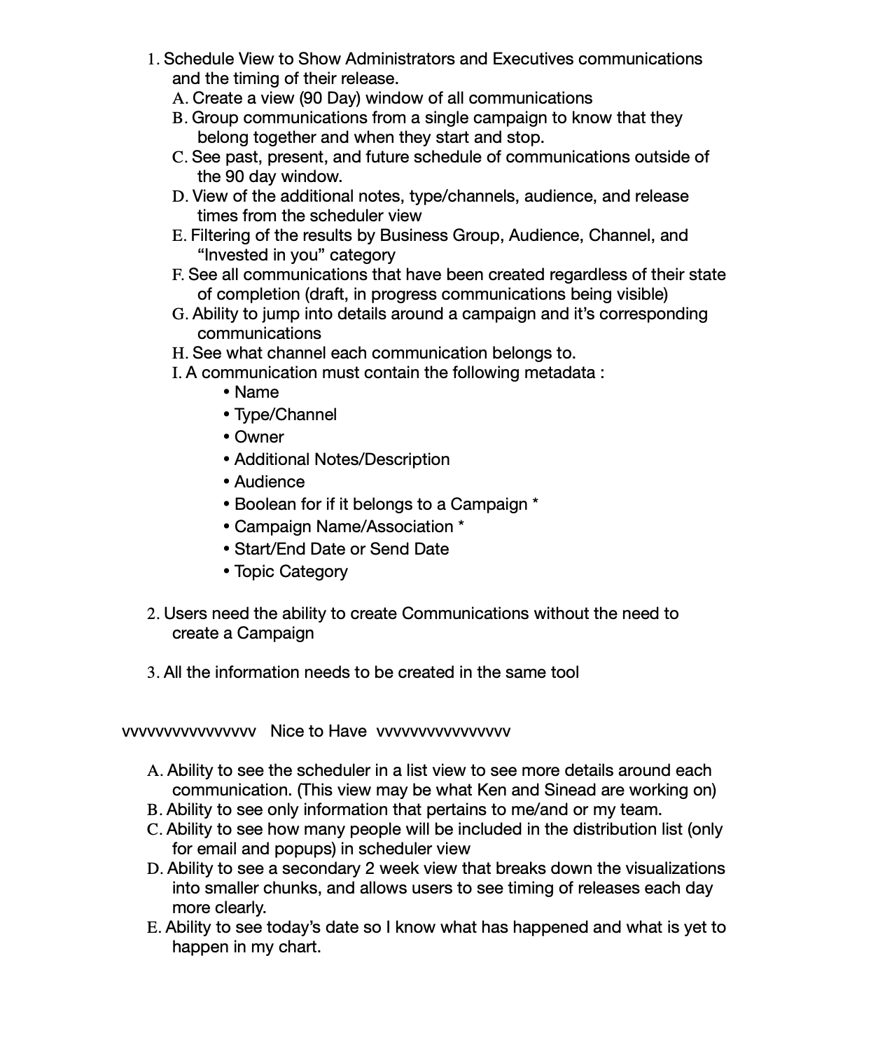
Initial workflow included an initial List View and a 90 day view as an alternate, but after overwhelming feedback, we found that the visualization provided by the 90 day graphic were much more compelling to our audience.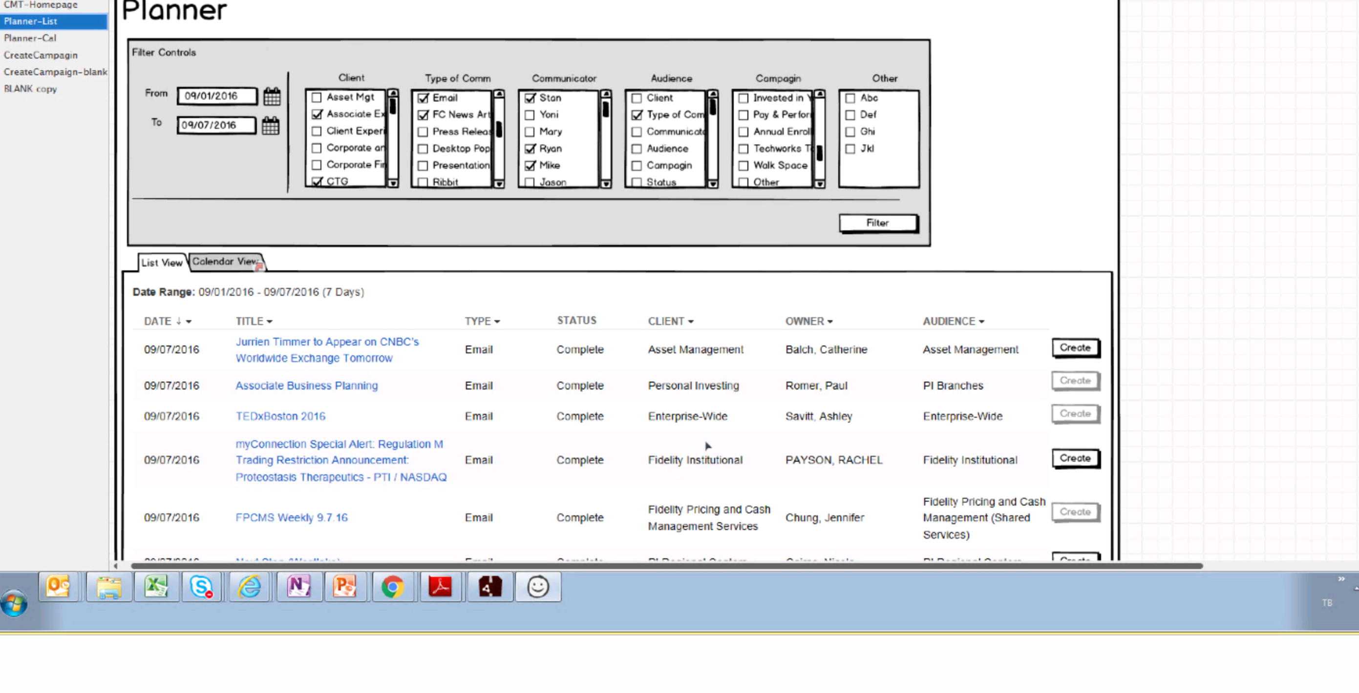
One initial low-fi design incorporated icons for media channels, but after more researcher we moved towards a single shape and color alone to differentiate.
